
How The 5% of Elites – Republican & Democrat – Steal $70K per year from 95% of American Workers, while colluding – from Left & Right – to annihilate any bottom’s up working people’s movement that has always been the engine of massive revolutionary change.
The original research in this video is made possible by generous contributions from supporters of the Dr.SHIVA Truth Freedom Health® movement. Please contribute so we may continue to bring you such original research, valuable education, and innovative solutions.
- Dr. Shiva Ayyadurai, MIT PhD – the Inventor of Email, scientist, engineer, educator- analyzes data from a RAND Report and discusses how the elites are essentially stealing $70k per year from every American worker today create TWO American pies: one for the 5%, the other for the 95%.
- The Rand Report by Carter Price & Catherine Edwards uses GDP to analyze trends of income from 1975-2018 and compares it to 1947 – 1974 to show how if you’re a working-class American today with a median income of $50k you should be making $120k.
- The GDP per capita growth specifically provides an incredible measure to assess if the growth of the American Pie has been fair. The truth is that GDP per capita growth analysis reveals that 95% of American workers income growth has fallen massively behind the growth of the 5% elites
- From 1947-1974 all income groups grew with GDP per capita growth, as it should be for the growing one American Pie.
- From the mid-1970’s to the present, the Elites started consolidating power so there was a massive divergence between the 95% of American Workers and the 5% of elites, whose income grew with GDP per capita growth, while the 95% did not – creating now TWO American pies.
- Left and Right starting with the McCarthy era of the 1950s colluded to destroy bottom’s up organic labor movements. The Right branded any worker’s movement “Communist”; and, the Left used that to create TOP-DOWN corrupt unions to suffocate grassroots worker’s movements.
- The only way forward back to ONE American Pie where ALL profit from GDP per Capita Growth is for Working People to UNITE and build a bottom’s up Worker’s movement.
EDITED TRANSCRIPT OF VIDEO
We’re going to be going back to our talk today, and it’s really going to be about the economic system of basically discussing how, if you’re a working-class person today, and you make, let’s say, $50,000, which is a median income, you should actually be making about $120,000. That’s what we’re going to talk about.
About the end of last year, a report came out done by the RAND Corporation. I don’t care for everything they do, but this was a very good analysis done by Carter Price and Catherine Edwards from 1975 to 2018, and they looked at the trends of income.
The RAND Report
And I just want to walk you through this, it’s a pretty deep analysis. We’re going to go through it, but I’m going to connect their economic analysis, which is this very specific diagram, which I’ll walk through, in which they put an immense amount of work looking at lots and lots of economic data, solving a lot of very interesting problems, and applying calculus to solve some very cool ideas and problems. But you’re going to understand very soon, how their economic analysis fundamentally shows that you as a, if you’re an American, let me just show this to you. In the United States, if you’re a working-class American, let’s say you’re earning somewhere between about a median income of $50,000, that fundamentally your income is being actually stolen. And I’ll talk to you about this. So, if you, let’s go over to the RAND Report, which is over here.
So, if you look at this Rand Report, which is this analysis that was done, I know that people on Instagram are watching it, this was what I was just sharing. It’s a very deep, deep analysis. And in this analysis, we’re going to discuss this diagram very carefully, that’ll show how our wages have been completely declining, particularly working people, the 95% of us, and then you’re going to understand that they did some very, very powerful, you know, mathematical analysis to come to this, looking at nearly about 100 years’ worth of data.

What is GDP?
So, we’re going to cover this. But we’re going to take a systems approach because, with a systems approach you can see how that analysis relates to what’s been going on in the labor movement in the United States, where it hasn’t been going on, frankly, and then we’re going to connect it to public health issues. And you’re going to see some very, very important trends. So, let’s just jump first into, before I go into this, does everyone know what GDP is, Gross Domestic Product, that’s the first thing we’re going to learn, the gross domestic product of a country. Well, the gross domestic product is really the economic activity, it’s a measure of the economic activity, and you can get into very interesting mathematical definitions of it. But it’s really the value added that’s coming out. And it’s really the value added that goes into the productive forces of that economy.
And then there’s also something called the value added that went into the intermediate consumption. But the bottom line, the GDP is a measure of the strength of an economy. Well, the United States economy is about, as of 2019, about, $20 to $21 trillion. That’s the GDP of the United States. And the GDP is important because it gives you the economy, but more important is the GDP Per Capita, that’s a second definition. So first, GDP, gross domestic product. The other definition is GDP Per Capita.
What is GDP Per Capita?
Well, if you take the economic activity of a country, the United States is around 21 trillion, and then you divide it, as of 2019 the U.S. is around 382 million people, and you divide it by that, you get the GDP Per Capita. Which means if you take the strength of that economy, how much is an individual’s value in contributing to that? So that comes to, in the United States, around $65,000 per person, so the GDP Per Capita in the United States is the total GDP divided by the population of people. Now to give you an idea, the GDP Per Capita of Luxembourg is around $120,000. Now, remember that denominator, they’re a very, very small country, so they can have a small GDP, but a very small number of people. So, the GDP Per Capita can be high.
Afghanistan is on the other extreme, around $512. India is around $7,000. China is around $19,000. So, you get an idea that GDP may be high in China, but they have about 1.4 billion people, a big denominator. We have about 382 million people. But when you look at the GDP Per Capita, you can look at countries and you can say, “oh, that country, the United States, is a wealthy country”. We have $65,000. Luxembourg is very wealthy $120,000. India is not so wealthy, around $7000 and China is around $19,000, trying to catch up to the United States. I think Mexico is around $15,000. So, India, frankly, is around a $2 trillion economy, and it’s frankly still very, very poor compared to these wealthy nations. So that’s why they call it a developing nation.
Review of Wages 1947-1974
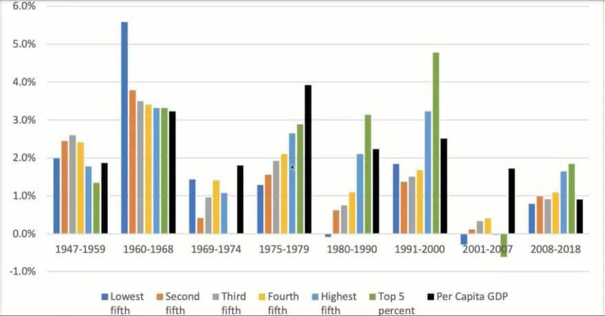
So, what these researchers did was they looked at the growth in the GDP Per Capita, during different cycles, during different, anywhere between 10–15-year cycles. And each of those business cycles, there’s about six to seven of them that they looked at, included both the recession in it in an economy as well as the expansion of the economy. And what they found was, and they did this, and let me share this with you, one of the important diagrams that they, that they discuss in there, let me bring this up, is that, and they did a very detailed analysis, and I’m going to walk you through this, and you’ll see it right here. And in this detailed analysis, what they found out is that, I’ll make it a little bit bigger, what they found here was something quite fascinating. And in fact, I’m going to zoom in on it so we can see it a little bit better on the screen. So now what you see in this graph here that we’re going to discuss, is this is looking at multiple business cycles, and it’s a very, very deep analysis. And again, what I enjoy doing is distilling these concepts. So, what you see here is 1947-1959, one business cycle; 1960-1968, another business cycle; 1969-1974, the third business cycle; and then there’s 1975-1979, 1980-1990, 1991-2000, 2001-2007, and 2008-2018. So, there’s 1,2,3,4,5,6,7,8 different business cycles. So, these scientists, these economists looked at these, what did I say, eight different business cycles, and what they identified in these eight business cycles was some very disturbing trends that will really give you an idea, that both Republicans and Democrats, left and right, have been screwing the American people, which is what I’ve been saying consistently.
That’s why our movement, the Truth Freedom Health Movement defies a Republican/Democrat, left/right, whether it’s Trump or non-Trump, the working class in the United States has been getting crushed. And no matter the words people say, let’s look at the actual deeds that have been taking place. So, this is the actual economic data done from this analysis.
So, let’s, let’s take a closer look. So, what do I mean? First of all, in every economic cycle, there are 1,2,3,4,5,6,7 bars, okay? The black bar is the GDP Per Capita, which is in fact the growth in the GDP Per Capita during this period. So, during 1947-1959, by way of example, the GDP Per Capita grew 2%, which means the GDP Per Capita, let’s say it was at about $40,000 in 1947, which means the entire GDP of the United States divided by the population at that time. I’m just making up that number, I don’t know what it was. It grew by 2% by the end of 1959. So, this is growth in the GDP, this is how well the economy grew. So, this grew 2%, you can look during the period 1960-1968 the GDP grew per capita by a little over 3½%, let’s say 3.2%. And the GDP growth, this was 1969-1974, the GDP growth went down, it was less than 2%. And during 1975-1979, which was a heyday, the GDP grew by 4% per capita And in 1980-1990 it was around 2%. And again here, 1991-2000 around 2½%. And then we drop back here to 2001-2007, and this was like the Dot Com Bust, that was around 1.8%. And here in 2008-2018, we’re at about 1%.
So, you can see the black bars are really the GDP Per Capita and it’s an indicator of the economic growth and how it was helping an individual. right? So, the GDP is really a measure of how all the work that people are doing, all the goods and services, and the contributions we made reflect on the individual, okay? So clearly, whatever the GDP is, what these guys did was they looked at the income growth, okay?
So, if the GDP grew 2%, which means your income should grow 2%. Does that make sense? Because the entire economy grew by 2% that means you should also be growing by 2%. Right? That would seem fair, okay? Or maybe you did even better than the economy. And so, let’s look at what they found here. Let’s go back here and look at the data here. So, what did they find here?
So, what they find here is during 1947-1959, it was actually quite an amazing period, post-World War Two, all income levels. By the way, the blue bar is the lowest fifth income quintile, okay? They call quintile, okay? The second fifth is the next income level, so, this could be people who are making, let’s say, $10,000 a year, this could be people who are making $20,000. This could be people who are making, let’s say, $30,000. These could be people, the yellow is the fourth income group, the fourth fifth, which is people are making, I don’t know, like $50,000. The blue is the people who are the highest income quintile, and these are what we call the top 5%. So, the light blue, and the light green are the top income quintiles These are sort of the working-class people between this range.
So, what do you see during 1947-1959? You know what? It’s interesting, that the incomes of all the different groups were around the GDP, which is great! Everyone was prospering from this growth in the economy. 1960-1968, even better! Working-class, even on the lowest end of the spectrum, and everyone was, in fact, these people are doing much better, that people are tracking the GDP, if everyone sees right around here. And if you look at 1960-1964, you see, except for the orange group, pretty much everyone is sort of at least, you know, around the same area.
Now, if you go to 1975, so during 1947 all the way to 1974, when things started shifting, things started changing around the 1974 period, you see that the people’s incomes are growing along with GDP, that’s a good thing, which means no one is really getting screwed. All income groups are doing well. I hope that makes sense. Any questions from people?
So, all income people, greetings to people from Norway too, are doing well. Now, what happens? This was quite profound. What starts happening in the mid-19 to the late 1970s, this is when the elite started consolidating power. Remember, during the period, in the early 1900s, late 1800s, there was a huge movement of the American working class, people were striking, there was a vibrant working-class movement, a bottoms-up movement. And that’s what gave rise to the economic growth. Bottoms-up worker’s movements were strong. The elites were forced to give the American worker good wages. They couldn’t cheat them. People were coming off World War Two who had fought for this country. So, you have to look back in the late 1800s. And the early 1900s, to understand there was a powerful bottoms-up, working-class movement in this country, which has been hidden from history books, but it was that working-class, bottoms-up movement. There were the Haymarket riots, there was 1900 strikes, the bottoms-up movements of all different trade unions in the United States, a very powerful movement that was the envy of many other working-class movements throughout the world. It was that bottoms-up working-class movement that scared the elites.

Review of Wages 1975-2018
So, they were basically under gunpoint at some level in the 1930s, when the Depression was occurring, that they were forced to give a lot of gains. And that’s what you see here, during this period, as you can see right here, that the result of that was in the 1940s to 1968, you know, and even sort of in the early part of 1969, everyone was prospering, meaning the GDP growth was in alignment. But look what happens starting in the mid-1970s… the elites started going back. They started wanting to consolidate power again. So, you had the Department of Education Forum, Centralization of Power, Big Pharma, Big Hospitals, Big Insurance, Lobbying Groups started getting together, left and right, Republican and Democrat. And the intent of that was to crush working people. They didn’t like all the gains that they had to give them. And their direct result, that’s what’s wonderful about the study, look at what you see here, what you start seeing right here, starting in the 1975-1979 period, look at what happened. GDP growth is around 4%. But look at what happens, it’s no longer around the same, okay? Income varies. Poor people, really poor people, get really screwed! Their incomes, look they’re at about 1.2%, nearly three times, three-four times away from the GDP. GDP Per Capita had grown by 4%. During this period, 1975-1979, the GDP Per Capita had grown by nearly 4%, which means everyone should be prospering at that 4% rate. You know, people in the first income quartile are down at 1%. People in the second, third, fourth, you can see they’re below 2%.
But guess who’s prospering here, it’s the highest fifth income quintile, right? The 95% and the top 5%. These are the people tracking, which means they’re close to 3-4%. And now the 80s and 90s get really worse. Look, it becomes negative for the lowest income quintile, right? You know, less than 1%. GDP is over 2%. The top 5% are exceeding that, and so is the top in the 95th percentile. And then in 1991-2000, look at this, the top 5% are close to 5%. They’re doing better than the GDP Per Capita. Okay? And meanwhile, so are the top 95%, which is, again, the light blue and the green. But everyone else is below 2%. Okay? So, you can see, again, very briefly put, again, to emphasize what’s going on, is that every day working people in the 90 percentile are not tracking with the growth that took place. Remember GDP is growth, and so the economy’s growing, and per capita you would think people should be at the black bar, but they’re below it, except the top 95%. And, you know, the people in the 95th percentile and the 5%, you can see that very clearly from this.
So essentially, the extremely wealthy, Republican and Democrat, are profiting extremely well.
All right. And it gets even more interesting during the dot-com bust, the GDP is here, and, in this case, this was an anomaly, the top 5% are below! What’s interesting in this case is they’re actually below the GDP. And so, what’s going on there? Well, you find that if you do the analysis, that during that period, the top 5% had most of their income in real income; they’d invested in real estate and stocks, what’s called capital income. So, remember people here are actually working for a living. People here are out of jobs. But here, these people are losing money, not because they’re suffering, they’re suffering, because their real estate investments, their equity investments, were down.
This is post-Dot-Com Bust, okay, so don’t feel sorry for them!
The GDP is here, now, where we are today, in 2008-2018, you can see again, the GDP is around 1% here but the elites in the 95% are doing double, you know, two times better. Okay? So, in summary, starting in the ‘80s, late ’70s-‘80’s what ended up happening was consolidation of power took place, and the average working-class American who, in the ‘48 to late ‘60s was doing well, which means they were tracking as the American Pie grew, everyone grew. That’s what it really means.
But starting in the mid-‘70s, as the American Pie grew and shrank, it didn’t correlate with people’s incomes, but the wealthy grew excessively, except with the capital income. Now, what this study interesting enough showed was during this year, let me go back to this, during the year 2018 alone, if you looked at the income, if you actually looked at the income of the American working class, the 90th percentile, which means 90% of us, that about $2.5 trillion in what should have been wage increases was actually taken away.
So, let me repeat that. If you add all the incomes of 90% of us, add all our wages, they went down by $2.5 trillion, okay? In 2018 alone. And then the researchers calculated if you went back from 1975 to 2018. And you looked at how much diminishing wages went down; it was close to $47 trillion. That means during 1975 to 2018, as the economy was growing, per capita 90% of us, our economies didn’t grow. In fact, that lack of income growth was calculated to be $47 trillion, which means their incomes and wages grew, but the 90% of us didn’t.
In fact, let me show you an example of this. They do a wonderful chart and the data that they put together, and again, it’s a tremendous effort that these guys did, and I really appreciate what they did… a lot of work. I mean, I spent a lot of time going through the math here and looking at it, but what you see here is quite fascinating. All right, this chart really tells the truth, let me share it here. And what this chart shares here is the actual, so, if you’re in the 25th%, which means low income, this is the median income, 75th%, 90-95th percentile, what you see here, that omega here represents 100% of GDP. Okay? So, people here in the first income quintile, were half of GDP, okay? In the medium income quintile, people are at a third of GDP. So, if you divide this, in 2018, if you were making $36,000, if you work it out, you should actually be making $111,000 if the income growth had kept up with GDP.
Now watch what’s fascinating here, the people in the 99th, 1% of the income quintile, they were 50% higher than GDP. Okay, so a guy who’s making $491,000 here, if he was tracking with the GDP, he should be at you know, about $353,000. But he’s at $491,000. And so, you can see here, that what this revealed was, what this analysis revealed was, that if your median income today as a working-class person is $50,000, you should actually be making $120,000.
Okay, so that $70,000 delta today, 2018-2020, this is in our range right now, was sucked up and it was taken to the elites, that’s what’s actually happened.
So, the economy is growing, everyone’s working harder, we’re all contributing to the GDP Per Capita, but we’re not getting what we’re contributing. So, if you’re working hard, you’re contributing to the growth of the GDP, you’re not getting your slice of the apple pie, okay? You’re in fact, going down. In fact, you’ve gone down by $70,000, okay? It’s not a small amount. So, your income before taxes has gone down by $70,000 alone this year, and the delta is going to keep increasing. But if you add up from around 2018, all the way back to 1975, all those lost wages, it adds up to $47 trillion.
So, let me throw up this chart again. And let’s go back to this chart. So, you have lost if you’re making $50 grand, and by the way, I can give you the numbers in other cases. If you’re making around $65 grand today, and you divide 35% by $65 grand, just a quick estimate, you should be making about $87,000.
Okay? If you’re in the 90th quintile, you’re making $112,000, you should be making around $160,000. $150-$160,000 roughly, okay? So, you can see what’s been happening to the American wage, that you’re literally not growing with the GDP. The American GDP is growing, which means all your hard work is helping things grow, but you’re not getting a piece of the American Pie.
Why Working People’s Wages Have Declined
Now, why is this happening? Now, the researchers were very careful, I’ll show you this in their paper. Remember, these guys are sort of, they’re “nerding” out on all the numbers, but they say very clearly upfront in their paper. It’s a great paper to read, and they say: “This study does not seek to explain why inequality has increased, but, instead, describes how income has changed from 1975 to the present.”
So, their goal was not to talk about why the income has changed, but I’m going to now apply a systems analysis. Again, as I mentioned to everyone, what we are attempting to do here is to educate people, we want to create Truth Freedom Health Warriors, and that’s why I do these, that’s why I stay awake late to do these, and Michelle’s here helping me out. Because without a systems understanding you’re going to say, “oh, okay, our wages are low.” “I guess the Democrats did that.” “I guess the Republicans did that.” “Oh, okay, let’s vote this time for Democrats.” “Let’s vote this time for a Republican.” Right? So, you see that and then Democrats will say, “oh, you know, the Republicans did this through taxes.” And the Republicans will say, “no, no, the Democrats did, you know, they regulate us too much.” Or, “they overtax us”, on and on and off, right? Left and right.
But this shrinking of your wages. Again, if you’re making $50,000 today, you should be making $120,000. Jeff Bezos, by the way, in six-nine months he doubled his value from about $100 billion to $200 billion. Okay, this is in six months. Your wages are going down. And meanwhile, you’re voting for this person, that person and, and including Trump’s era, okay? So be very careful. Do not get caught in this left and right, Trump/ non-Trump, Republican/Democrat, okay?
I voted for Trump; I gave him money. But I’ll tell you this, when you take a systems approach, you realize there’s something deeper and more fundamental. And this chart is going to make it very clear to you and it’s going to blow your mind. Okay, let me share this with you. All right. So, first of all, let’s put this chart here. And you’re going to see this right away. So, what you see is the decline of American wages during this period ‘47 to 2008, right? The wages of working people, look at right here, 2% has gone down to 1%.
Okay, people here, we’re tracking it, are 2½, they’ve gone down to below 1%. Okay? The elites have done pretty well, they’ve maintained, they’ve grown, etc. So, what occurred between 1947 to 2008? Remember what I said, look, the wages of working people have gone down. Okay? So, 1940-1948, remember, what I said was during the early 1900s, late 1800s, all the way up leading up to the 1930s, there was a huge vibrant working-class movement. The American workers, the trade unions were under an American bottoms-up movement. I’m not talking about the top-down unions, which the mobs that took over. The bottom part of the working-class movement was powerful. That’s why those gains came.
And this graph is, I just connected this this morning. And you’ll see this graph puts it all together. Do you see this graph here? What does this graph show? I want everyone to look at it. This is, you know what this is? This is workers striking between 1947 until 2018. It’s during the same period! Look at this! I just found this independently. Okay? So yes, there is a why, and the why is that the American working people stopped uniting and fighting bottoms-up.
Why We Must Build A Bottoms Up Movement
The unions, the left and the right, the right-wing as I’m playing my video, anytime we try to organize this, and “Oh, that must be Communist. Communist!” And even in the last election, “Socialism, Socialism!” That’s not what it is. It was fascism first of all. So, the right-wing attacks every time we try to organize as Communist, Marxist, right? Working people, they brand it.
So, what does the left wing do? The left wing takes people away from building a bottoms-up movement and says “No, join me… I’m Bernie Sanders.” “I’m Elizabeth Warren, I’m going to join the unions.” And the unions are all totally top-down controlled. They don’t even want workers to strike anymore. Okay? They don’t.
And look what’s happened. Look at this graph right here. It says it all. Look what’s happened. During 1947, this period was the heyday when people were fighting, okay? Look, there were strikes upon strikes look at the number of workers involved. Look at this, if you add all of this, these were about 100 million workers involved in striking. Hundreds of millions of workers over the period 1947 to 1977 would strike and look at this drop! It’s an exponential drop starting, where do you see it? Right in 1974, all the way down? We don’t have worker strikes anymore. We don’t have movement of workers. We have nothing.
No one wants to show you this graph. Okay, let me share it with you. I was sharing the wrong one. Okay? So, no wonder everyone wasn’t getting excited. Okay? Let me share with you this graph. I’m going to share the entire screen. So, if you see this graph right here, right here trends, and we go right here, what do you see? During 1947 this is all the working-class movements. This was a remnant of what was built in the 1920s and ‘30s. Lots of people were striking and taking to the streets, right? Hundreds of millions of workers, because people were fighting for their rights.
And then right here, right around here, you see it dropped. Probably this was the last time this bar right here that’d be ‘67,10 years it comes to you 1970s. That’s where the decline occurs. 1975 boom! So workers stopped organizing by themselves. The unions basically sell out. Democrats and Republicans unite and you have no movement. That’s what you have.
I hope everyone sees that. Is that clear to everyone? Do you guys see this? Basically, when we stopped organizing bottoms-up to build our own capabilities, bottoms up. That’s what you had. You had this massive decline in wages because we stopped organizing bottoms up. I hope everyone sees that.
Exactly!!! There you go. Dan Sorensen, you nailed it. You nailed it. Dan Sorenson brilliant. Okay. Kenneth Fielding says, “Holy ****, my union bargained away the right to strike.” That’s what they did. Okay, Justin, I hope you can see the graph now. Exactly!
Wake up, people!!
This is why the only movement, and I say this with full confidence without any ego hyperbole, the only movement that has a scientific basis to win and defeat the establishment is our movement because we want to build a bottoms-up movement. The left ain’t gonna do it, the right isn’t going to do it. Trump ain’t. Trump had four years, I’m sorry, he didn’t lock Hillary up! Nothing happened! So, let go of that. Don’t get caught into the MAGA Party, the Patriot Party, the Libertarian, this movement is the only movement, and having said that, I’m going to come back. I’m not done. But I’ve got to take a break.
So, you guys get out of your way and become Truth Freedom Health Warriors. You gotta do it for yourself. And Sandy and Justin, who are warriors, I just saw them on here, they’re going to tell you what we’ve got to do. We’ve got to build a bottoms-up movement, but you must understand why you have to go, right now, online, support this movement in any way you can. You can just sign up and become a member. So, you can start building community, you can also sign up as a supporter, start your education plan, but I don’t want you to give me anything for nothing. When you support this movement. We give you a tremendous MIT-type education. I want to make you guys all nuclear physicists of building revolutionary movements. So, let me just take a quick break and share with you what that is.
Okay, so let me go right here to the Truth Freedom Health Warrior Training Program. So, if you go to vashiva.com/join we are building our own movement, we have our own data center, we have our own hardware, we have our own software, we don’t rely on big tech, this is by the people, for the people.
It’s time we move beyond the Left vs. Right, Republican vs. Democrat. It’s time YOU learn how to apply a systems approach to get the Truth Freedom Health you need and deserve. Become a Truth Freedom Health Warrior.
Join the VASHIVA community – an integrated EDUCATIONAL, COMMUNICATIONS – independent of Big Tech -, and LOCAL ACTIVISM platform to empower YOU to actualize Truth Freedom Health in your local communities by employing a SYSTEMS APPROACH.
The platform we are building for Truth Freedom Health provides the infrastructure to take on Big Tech, Big Pharma, and Big Academia. Many of you have asked how you can help. You can contribute whatever you can. Based on your level of commitment to get educated, I have also created some wonderful educational gifts to thank you for your contribution.
To get the education you need and deserve, join Dr.SHIVA on his Foundations of Systems course. This course will provide you three pillars of knowledge with the Foundation of Systems Thinking. The three pillars include: 1) The System Dynamics of Truth Freedom Health, 2) The Power of a Bottom’s Up Movement, and 3) The Not So Obvious Establishment. In this course, you will also learn fundamental principles of all systems including your body.
Course registration includes access to his LIVE Monday training, access to the Your Body, Your System tool, four (4) eBooks including the bestselling System and Revolution, access to the Systems Health portal and communications tools – independent of Big Tech – including a forum and social media for you to build community with other Truth Freedom Health Warriors.
This course is available online for you to study at your own pace.
It’s time to Get Educated, or Be Enslaved.
Reference to Original Live Video