
What AM I Seeing
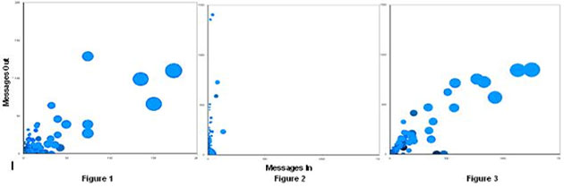
The above visualization titled Correspondent Crowds was developed by Perer and Smith. The visual represents email communication of three people with their peers over a period of time.
The figures, presented as scatter plots, shows emails sent by each person to their correspondents along the Y-axis and the emails received by the person along X-axis. The blue circles represent one or more emails exchanged by the person with one of his/her correspondents. The size of each circle indicates total number of emails exchanged with a particular correspondent.
Figure 1 above represents a person who typically responds to issues reported to him/her. A number of circles are closer to X-axis than Y-axis indicating more emails are being sent for every email received. The larger circles also indicate this person sends multiple emails to some correspondents, to keep such correspondents up-to-date on larger issues.
Figure 2 represents a person who sends out a large number of emails that either may be status tracking messages or request for information. The size of the circles is small and even, indicating that the number of messages sent to or received from his/her correspondents are not that high. This is seen in the way the circles lean closer to Y-axis, which represents emails sent out.
Figure 3 shows an even distribution of circles along both axes, indicating number of emails sent and received is mostly equal and more or less the same number of emails are exchanged with most correspondents.

Diagram from paper: Email Visualization – Correspondent Crowds, visually representing volume of emails sent and received by employees with their peers and their organizational dynamics
How Is This Beneficial To Me?
The visual represents the dynamics of organizational structure on communication among the employees. The graph shows meaningful cluster of communication among individuals. For example, circles leaning towards Y-axis indicate this person reports up to another person and circles leaning towards Y-axis indicates the person has many people reporting to him/her. The size of circles and its lean towards Y-axis may indicate a lot emails are sent to a correspondent who is not responding as much via email which should lead the person to explore other means of communication to improve effectiveness. Large size of circles also indicate which correspondence are taking up a lot of the time of the person which may help in making process improvements in the organization. The graph may prove very helpful to business process analysts for suggesting organizational improvements.

Source
[1] Adam Perer & Marc A. Smith. Contrasting Portraits of Email Practices: Visual approaches to reflection and analysis, In Advanced Visual Interfaces 2006. ACM Press, Venice, Italy.
You May Also Be Interested In


